Role
Research•Concept Development•Editorial Design•Typography & Print Production
Deliverables
17-page Concertina Publication • Printed Prototype • Editorial System • Experimental Typography
Highlights
• Experimental editorial publication exploring narrative through type
• Typography used as the primary storytelling device
• Printed concertina format inspired by tectonic movement
• Explored rhythm, fragmentation, scale, rotation and broken grids
• Demonstrates concept-led experimentation and editorial thinking
• Foundation for a future immersive typographic installation
• Typography used as the primary storytelling device
• Printed concertina format inspired by tectonic movement
• Explored rhythm, fragmentation, scale, rotation and broken grids
• Demonstrates concept-led experimentation and editorial thinking
• Foundation for a future immersive typographic installation
Can typography communicate the emotional experience of an event as powerfully as the words themselves?
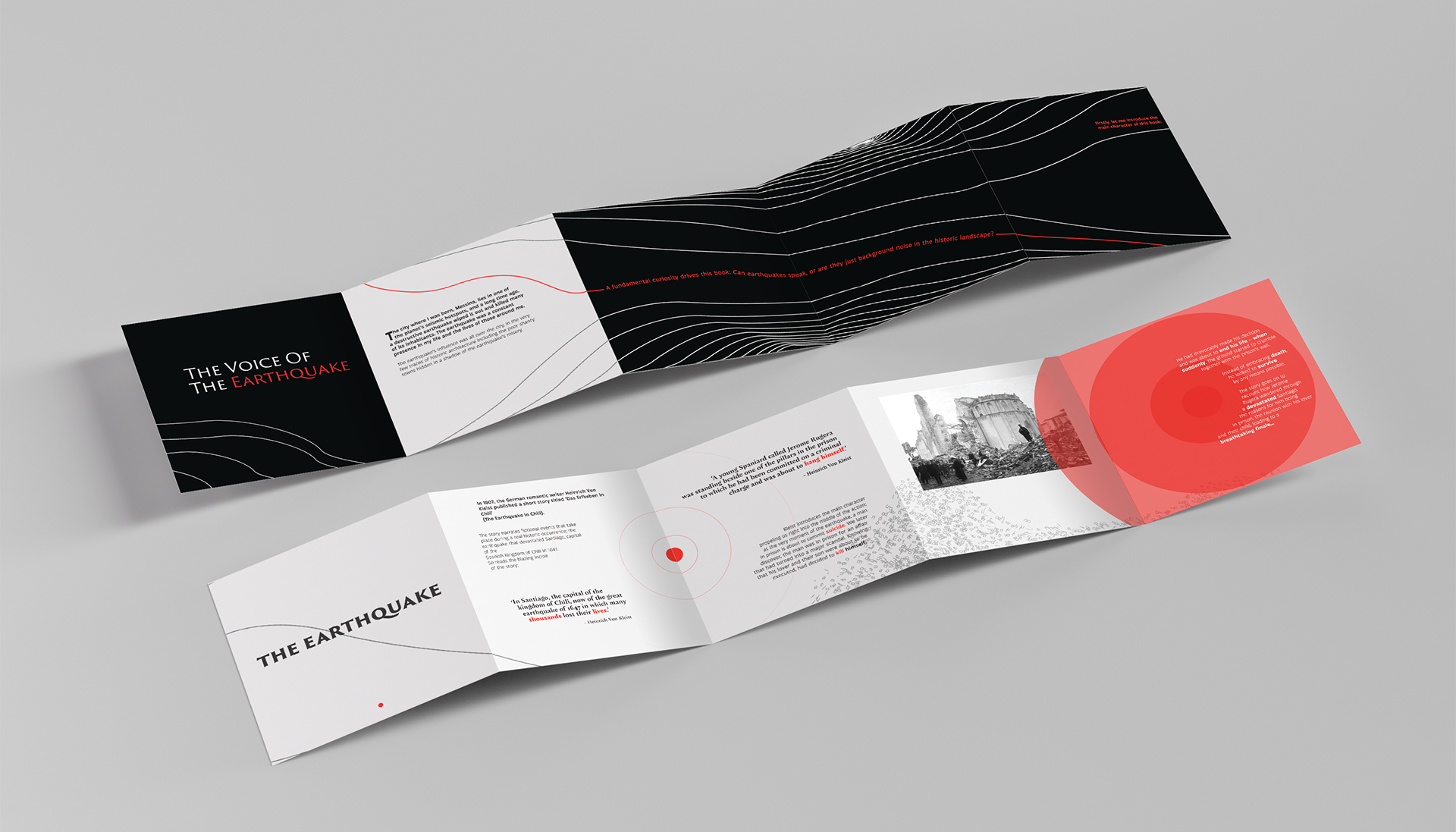
Faultlines is an experimental editorial project inspired by Heinrich von Kleist's "The Earthquake in Chile", a fictional narrative set against the real events of the 1647 Santiago earthquake. Rather than illustrating the destruction, the publication uses typography itself to embody the instability, tension and aftermath of the disaster.
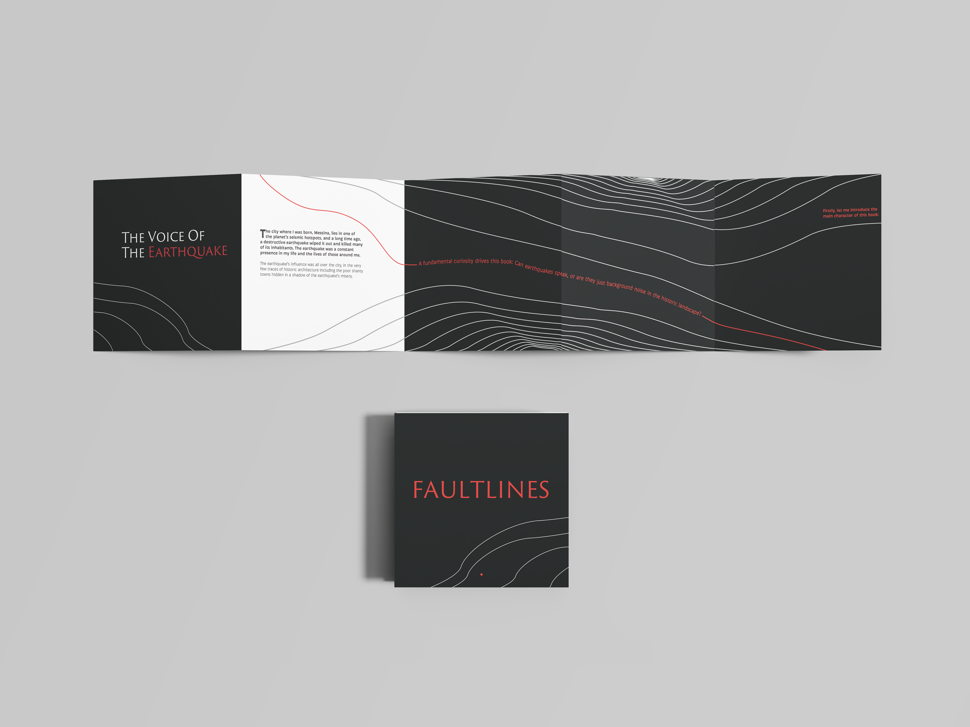
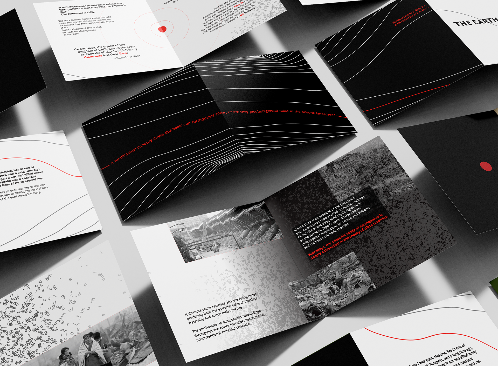
Presented as a 17-page concertina publication, the format encourages readers to experience the narrative as one continuous journey, echoing the movement of a tectonic fault line beneath the Earth's surface. As the story unfolds, carefully controlled shifts in rhythm, scale, fragmentation, layering and broken grids mirror the growing instability of the earthquake before gradually settling into silence.
Looking ahead, Faultlines has the potential to evolve beyond print into an immersive installation, combining large-scale typography, survivor accounts and spatial storytelling to create an experience that invites visitors to feel the emotional weight of the narrative rather than simply observe it.
Challenges
The 1647 Santiago earthquake devastated the city of Santiago on 13 May 1647, destroying much of the city and resulting in thousands of deaths, becoming known as one of the most significant earthquake disasters in Chilean history and has continued to influence historical accounts, literature and cultural memory.
Centuries later, Heinrich von Kleist used the event as the setting for The Earthquake in Chile, a novella that explores themes of love, religion, social judgement and the unpredictability of human nature. While the earthquake provides the catalyst for the story, the narrative ultimately examines how society responds to catastrophe rather than the disaster itself.
The challenge was to explore whether typography could become the primary storytelling device, communicating both the physical violence of the earthquake and the emotional intensity of Kleist's narrative through editorial design alone, allowing readers to experience emotion, movement and tension as part of the narrative.. The publication needed to balance experimentation with legibility while maintaining the integrity of the text. Choosing a concertina format introduced an additional challenge of creating a continuous reading experience that echoed the movement of a tectonic fault line while maintaining rhythm, pacing and narrative flow across the entire publication.
Insights
Research into the 1647 Santiago earthquake, Kleist's novella and experimental editorial design revealed that the emotional impact of the story lies not in depicting destruction, but in conveying instability, uncertainty and shifting human emotion. Rather than illustrating collapsing buildings or dramatic scenes, typography itself could embody these qualities through composition and movement.
This insight suggested that editorial design could become an active storytelling medium, using scale, fragmentation, spacing and rhythm to immerse readers in the narrative while preserving the clarity of the text and shaping the reader's emotional experience.
Approach
Faultlines is an experimental editorial publication inspired by The Earthquake in Chile. Presented as a 17-page concertina publication, the format transforms the story into one continuous visual journey, reflecting the movement of a tectonic fault line beneath the Earth's surface.
Set in Trajan and Auster, the typography gradually shifts in rhythm, scale, fragmentation, layering and grid structure to mirror the mounting tension of the earthquake before resolving into calmer compositions as the narrative reaches its conclusion. Rather than functioning as a neutral container for text, typography becomes the primary storytelling device, communicating atmosphere and emotion alongside the words themselves.
By reinterpreting a historic disaster and a literary narrative through expressive typography, Faultlines demonstrates how editorial design can transform reading into an immersive experience. The concept also offers potential to expand beyond print into a spatial installation, combining large-scale typography, sound and survivor accounts to allow audiences to experience the emotional weight of the story in a more physical and engaging way.
I would like to explore further with this project in regard to a printed publication and immersive experience.